


The reason I am writing this piece, first of all, is the corporate-identity design competitions that seem to be announced every single day — and my wish to draw attention to the strategically weak work they produce and the waste of the resources poured into them. In particular, many of these competitions fail to address the essentials of a strong brand identity. Moreover, the lack of focus on brand identity leads to results that aren’t sustainable for companies.
The industry press props these competitions up as if they were a good thing, and the result is strategy-less images that own no value. This has gone on for years. And then we lament: “We have no brands, our brands!” — “We design but can’t produce value!” Strong brand identity is what truly sets a business apart.
What should a good brand visual identity be like?
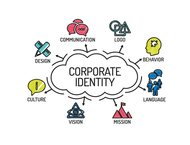
Designing a logo does not mean creating a good identity. The logo is only one of the parts of a visual identity. Font, color, graphics, and complementary colors — the visual world is a whole. Even when the parts of that world are used on their own, we can tell which brand they belong to. That is the power of brand identity in action.
A brand is an index of expectations, memories, stories, and relationships that sets a product apart from others. The logo works to fulfill the brand’s reason for being.
A good brand visual identity should meet the following criteria.
- Does it clearly express the brand’s reason for being?
The brand’s reason for being represents the brand’s essence, and it is abstract. Because it is abstract, it cannot be grasped by hand and its experience cannot be imitated. The visual identity should make this unique, abstract reason for being felt. In conclusion, paying attention to bran identity is a significant factor in the long-term recognition of a company.
- Is it validated by market research?
What the designer has in mind and what consumers feel may not be the same. That is why the core values and the design need to be validated in consumer testing. An identity that isn’t validated never becomes more than a nice picture.
- Does it fit the brand personality?
In a world where products are similar in quality and their tangible benefits are almost identical, the fundamental element that sets products and services apart is brand identity. Think of the rebellious spirit of Diesel, or of Fanta with its jester-like personality.
- Does it carry a distinctive “blot” value?
Carrying blot value greatly increases an identity’s memorability. It also makes it easier to stand out from the competition. As the name suggests — a blot; every blot is unique. You could not copy it even if you wanted to.
- Does it have a harmonious color palette?
A visual identity represents a whole world; the logo is only one part of it. In the same way, the colors used are supporting parts of that world.
- Can the choice of font become part of the identity?
The font family is the language of the visual identity. When it is in harmony with the brand identity and the symbol, it strengthens memorability. Think of Mercedes’ font family.
- Is it supported by graphics?
The graphics used in relation to the product or services, and the feeling of the photographs, should reflect the spirit of the corporate identity. Think of Google’s icons. Look at the photographs in IKEA’s catalogs.
- Is it suitable for print and the digital world?
A logo can look quite appealing on a computer screen, but it must never be considered independently of the properties of the material it will be printed on and the places it will be used. A good designer must have a command of printing techniques and must not turn a critical error into a fiasco in application.
- Symbol or logotype?
If you have a phonetically strong and original name, you should prefer a logotype. If the name is also used across different product areas, using a symbol makes your job easier; but teaching symbols takes time and money — though they serve as indestructible fortresses.

